Whitespace Matters

What Is Whitespace?
White space is the area around and within design elements. These elements typically are images, typography, and icons etc. It is often used to balance elements on a page by creating a natural flow for the user to navigate through the content. Thus, making the information easier to digest. Despite its name, white space does not need to be WHITE. It can be any color, texture, pattern or even a background image.
Why Does Whitespace Matter?
When people visit a website, they mostly tend to scan the content before they decide to read it. Whitespaces take a big part in making content scannable, which makes it more engaging. While aesthetics is one of the benefits, others revolve around tangible impacts on the effectiveness of the page. In other words, white space significantly boosts not only UI (User Interface) but also UX (User Experience) of the page.
Let us look at some key advantages of using white space.
1. Improves legibility of text:
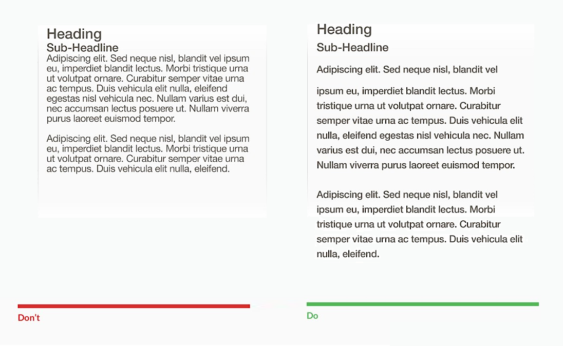
When optimizing text content, always keep in mind its paragraphs and margins. The larger the line spacing is, the better experience will visitors have, provided that you do not add too much as the text may appear disconnected.
2. Emphasize on elements:
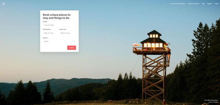
Negative space helps the hero element stand out, as we’ve seen before. It also helps focus only on the feature or product that you want.
3. Communicate what’s related:
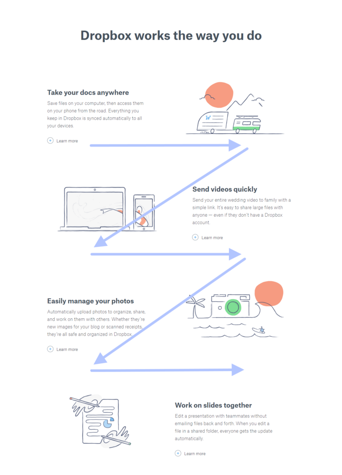
Things grouped closely together are perceived to be related, whereas those at a distance are believed to be different. The amount of white space between your content acts as a visual cue, showing visitors the relationship between different elements of the content. Objects can be grouped together by decreasing the white space between them, or divided by increasing it.
4. Create visual hierarchy:
If cluttering your interface overloads your user with too much information, then reducing the clutter will improve comprehension: by removing distractions, you force users to focus only on what’s immediately visible. Think of whitespace as a volume knob for UI distractions — more whitespace equals less noise, making it easier to focus. When a layout strikes the right balance of whitespace, it’s easier to process and comprehend text, easier to decipher icons and images, and provides a better overall user experience.
5. Create a feeling of sophistication and elegance:
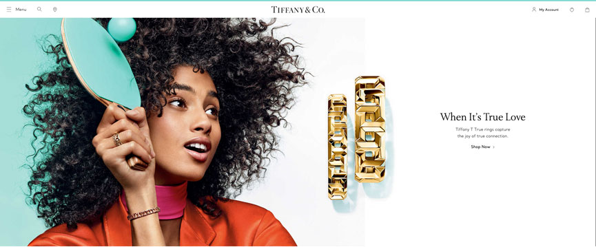
Although whitespace is often considered a technique for improving user experience, it can also be used for purely aesthetic purposes. Websites with larger amounts of whitespace may reflect minimalism and luxury.Whitespace contributes to the tone of the overall design and can make a product look luxurious by putting more focus on the product itself, rather than on nearby objects.
White space Pitfalls: What to Watch For
If there is too much space and no real direction, it detracts from your content rather than pulling the reader in and enticing them to learn more. Of course, there’s a fine line between creativity and overwhelming minimalism. If you’re not leaving the reader wanting to learn more – there’s a good chance they won’t come back. When deployed intelligently and intentionally, white space can elevate your designs to a place of elegance and sophistication.